![]()
Transformed a fragmented, multi-device video creation process into a structured, mobile-first system—enabling agents to record and publish in a single session and reducing turnaround from days to minutes.
Design Insight: Designed a guided workflow that maintains user momentum by making progress visible, reducing decision friction, and ensuring a clear path from capture to publish.
Impact: Designed a guided workflow that maintains user momentum by making progress visible, reducing decision friction, and ensuring a clear path from capture to publish.
Context
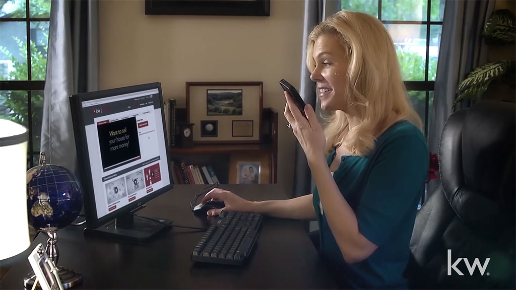
KW Video is a SaaS communication platform used by over 191,000 real estate agents to create and distribute personalized marketing videos. The original system relied on manual post-processing and multi-device workflows, introducing multi-day delays that made the product impractical for real-world use.
The Core Problem
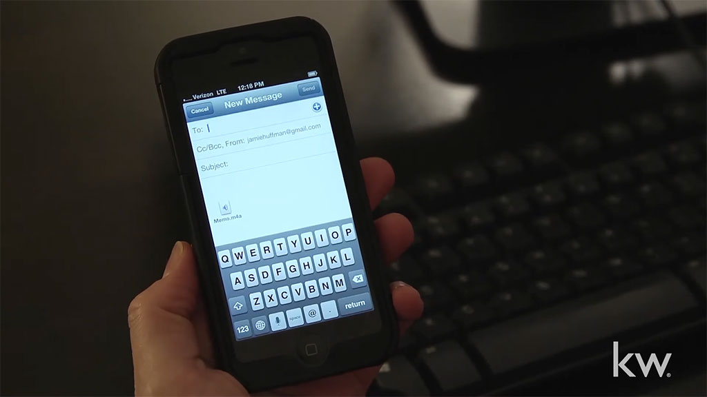
The workflow was slow and fragmented. Agents had to move between devices, record content across multiple tools and steps, email assets, and wait days for processing before they could share a finished video.
The issue wasn’t the interface—it was the system. The process made it difficult to complete tasks quickly, leading to delays, drop-off, and low completion rates.


Constraints + Considerations
- Limited budget and compressed timeline
- Small cross-functional team
- Stakeholder approval required at key milestones
- Needed to work across iOS and Android
- No direct access to end users during development
These constraints meant focusing on the biggest bottlenecks first and making practical improvements that could ship quickly.
My Role
I led the redesign end-to-end, working closely with a producer and lead engineer to restructure the workflow from capture to publish.
Most of the work was figuring out how to simplify the process—what to remove, what to combine, and how to guide users so they could move through it quickly without getting stuck.
Key Design Decisions
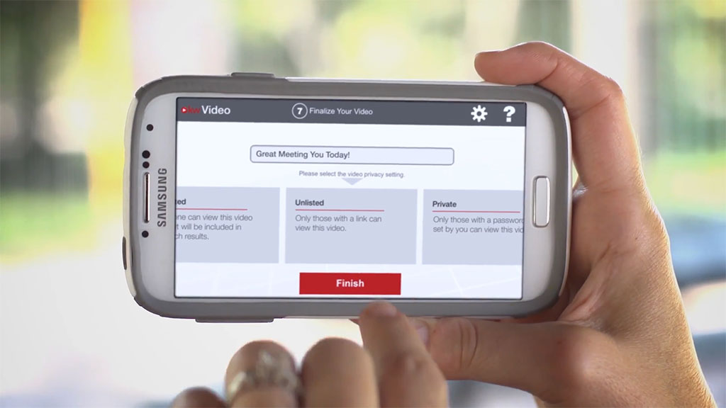
1. Consolidated a fragmented workflow into a single system
Restructured a multi-device, multi-step process into a unified flow that supports recording through publishing in one place. Designed the system to maintain forward momentum through clear steps, immediate feedback, and removal of manual handoffs.
2. Introduced flexibility without increasing cognitive load
Expanded control over messaging and media while maintaining usability by progressively revealing options only when relevant. This allowed for customization without overwhelming users or disrupting flow.
3. Prioritized system-level changes over surface-level redesign
Focused on removing structural bottlenecks—multi-device dependencies, manual processing, and delays—rather than relying on visual redesign. This produced the largest gains in speed and usability with minimal interface disruption.
4. Standardized interaction behavior across platforms
Aligned core interaction patterns across iOS, Android, and web to ensure users could move between devices without relearning system behavior, while allowing layouts to adapt to platform constraints.
Interaction Model
The system is built around clear progression and immediate feedback.
Each step reflects the current state—recording, processing, previewing, publishing—so users always know what’s happening and what to do next.
This reduces uncertainty and helps users move through the workflow quickly and confidently.
Tradeoffs & Design Tensions
Control vs Simplicity
Providing greater control over messaging and media risked increasing complexity. Addressed this by structuring the system to reveal options contextually, allowing advanced control without disrupting the primary flow.
Speed to Delivery vs Depth of Validation
Compressed timelines and lack of direct user access limited traditional validation. Prioritized removing high-impact bottlenecks first, accepting that some refinements would follow post-launch based on real-world usage.
Mobile-First Design vs Cross-Platform Consistency
Compressed timelines and lack of direct user access limited traditional validation. Prioritized removing high-impact bottlenecks first, accepting that some refinements would follow post-launch based on real-world usage.
Implementation & Collaboration
I worked closely with engineering to define workflow behavior, edge cases, and system logic, ensuring the experience worked reliably across platforms.
Owning both interaction design and UI allowed us to iterate quickly and reduce handoff friction within a small team.
Outcomes
- Reduced video creation time from days to minutes
- Enabled agents to record and publish videos on-site, in a single session
- Improved completion by simplifying decision points and reducing drop-off
- Supported ongoing client communication through automated and scheduled touchpoints
Reflections
This project reinforced the value of simplifying complex systems into clear, step-by-step workflows.
Even though the system supported flexible customization, the interface needed to show only what was relevant at each step.